Amimed. Cover image
Healthcare

Amimed

Designed to feel like deep sleep.

The brief

A healthcare brand built around rest, not diagnosis.

The idea

Amimed provides sleep therapy devices, an industry that usually looks and sounds clinical. We wanted the brand to feel less like a diagnosis and more like a good night's rest.

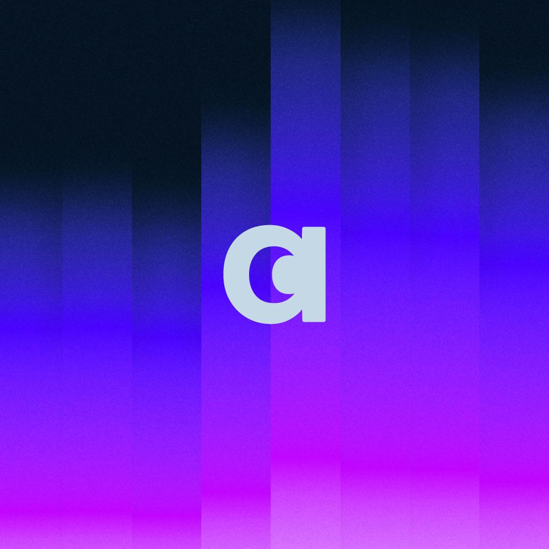
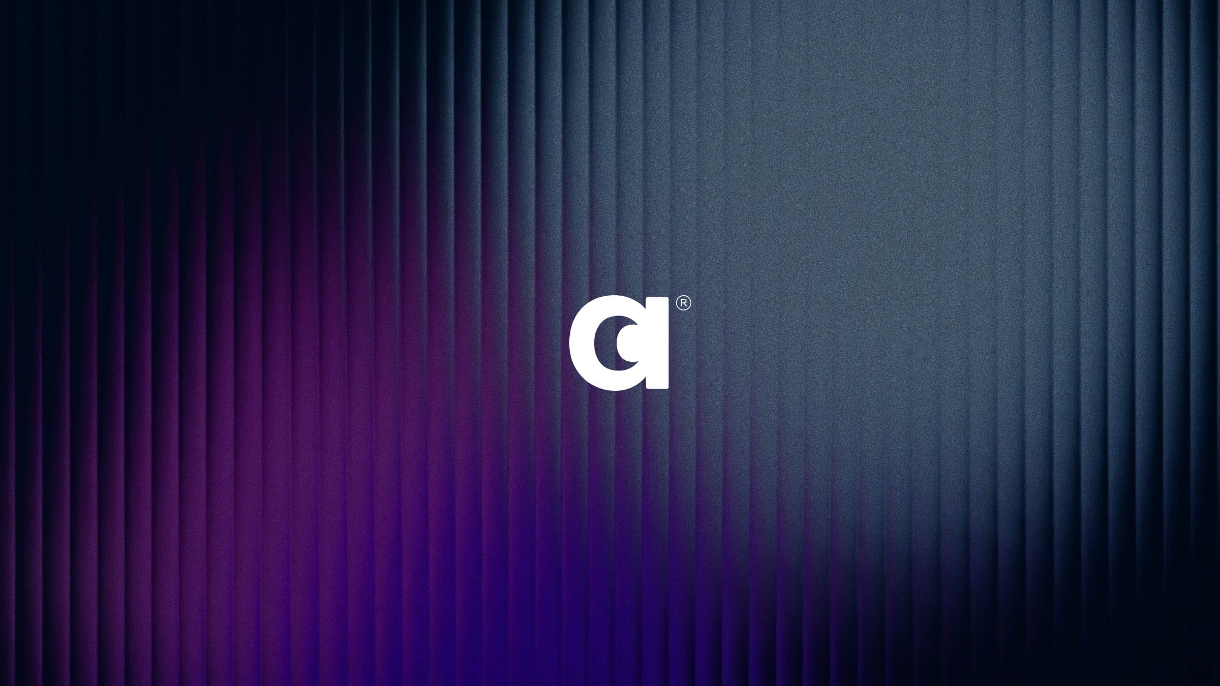
The identity is built around a gradient pattern that moves like a slow wave, a loose, abstracted nod to the bars in a sleep quality graph without ever feeling like a chart. The palette drifts from a deep, cozy night into a soft morning blue, the same shift the product is meant to help people make.

Client
Amimed
Year
2020
Industry
Healthcare
Amimed. The a mark over the gradient pattern, bars fading from night blue into violet.
Amimed. The wordmark in pale blue on deep navy, beside a sliver of the gradient.
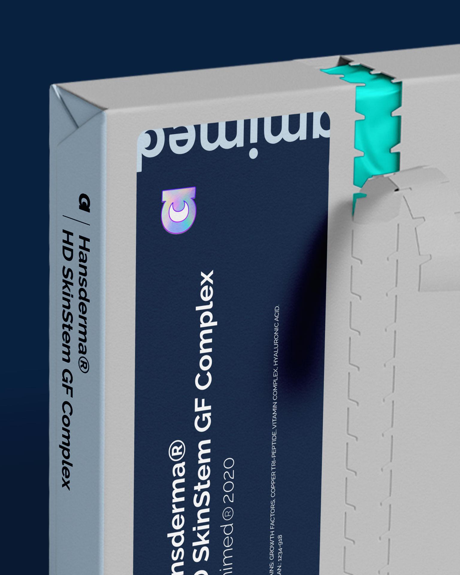
Amimed. A navy skincare box with the wordmark, opened along its tear strip.
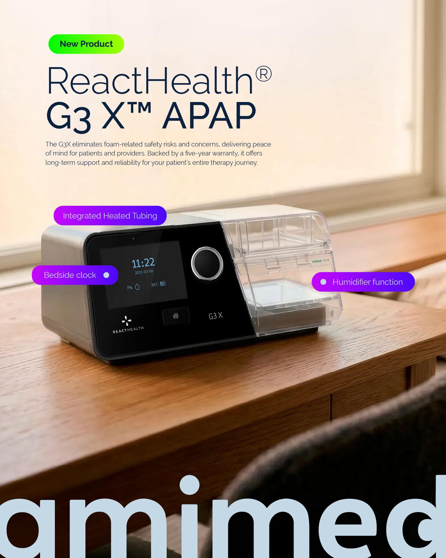
Amimed. An ad for a sleep therapy device on a bedside table, above a large wordmark.
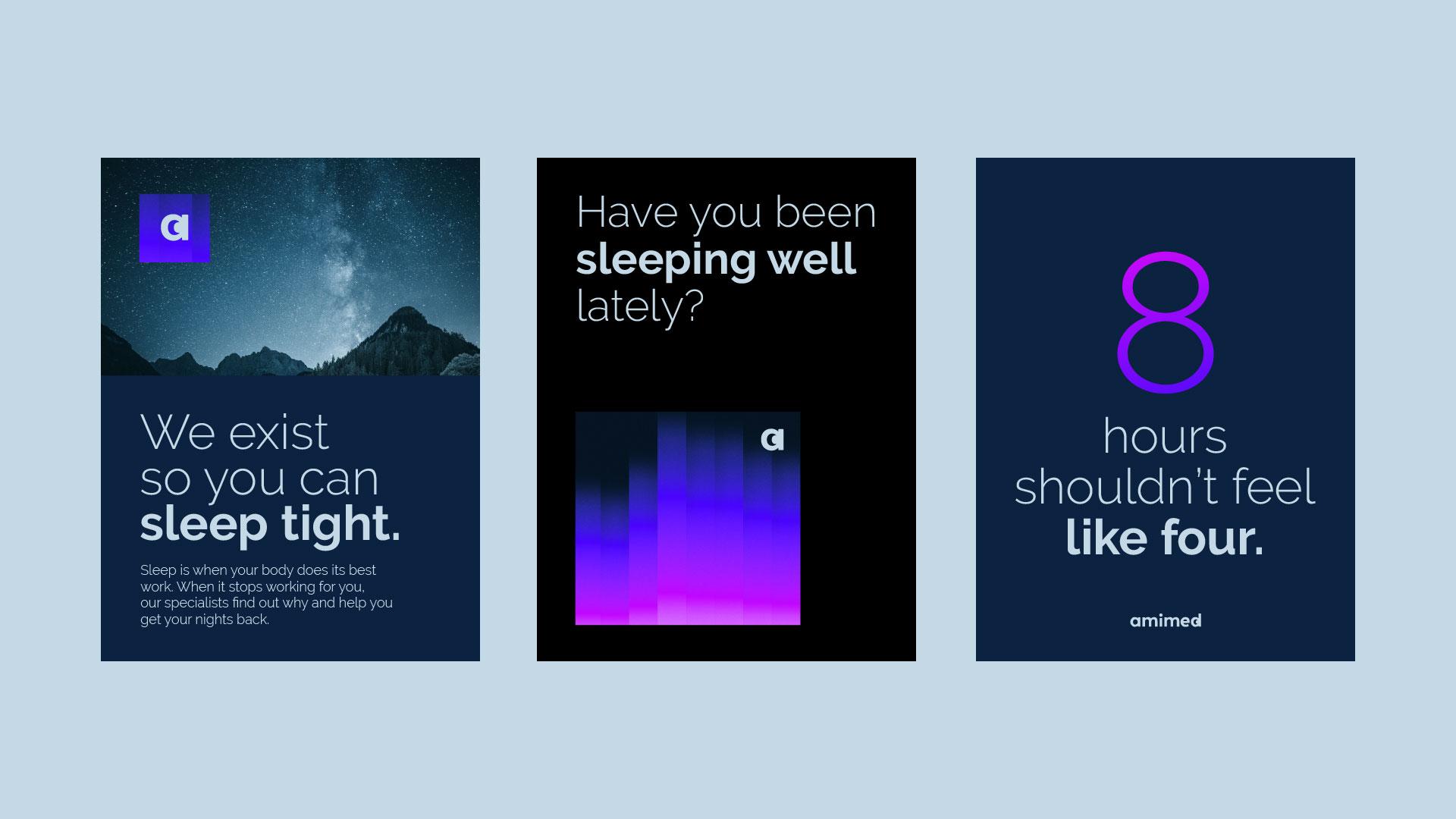
Amimed. Three posters: "We exist so you can sleep tight," "Have you been sleeping well lately?" and "8 hours shouldn't feel like four."
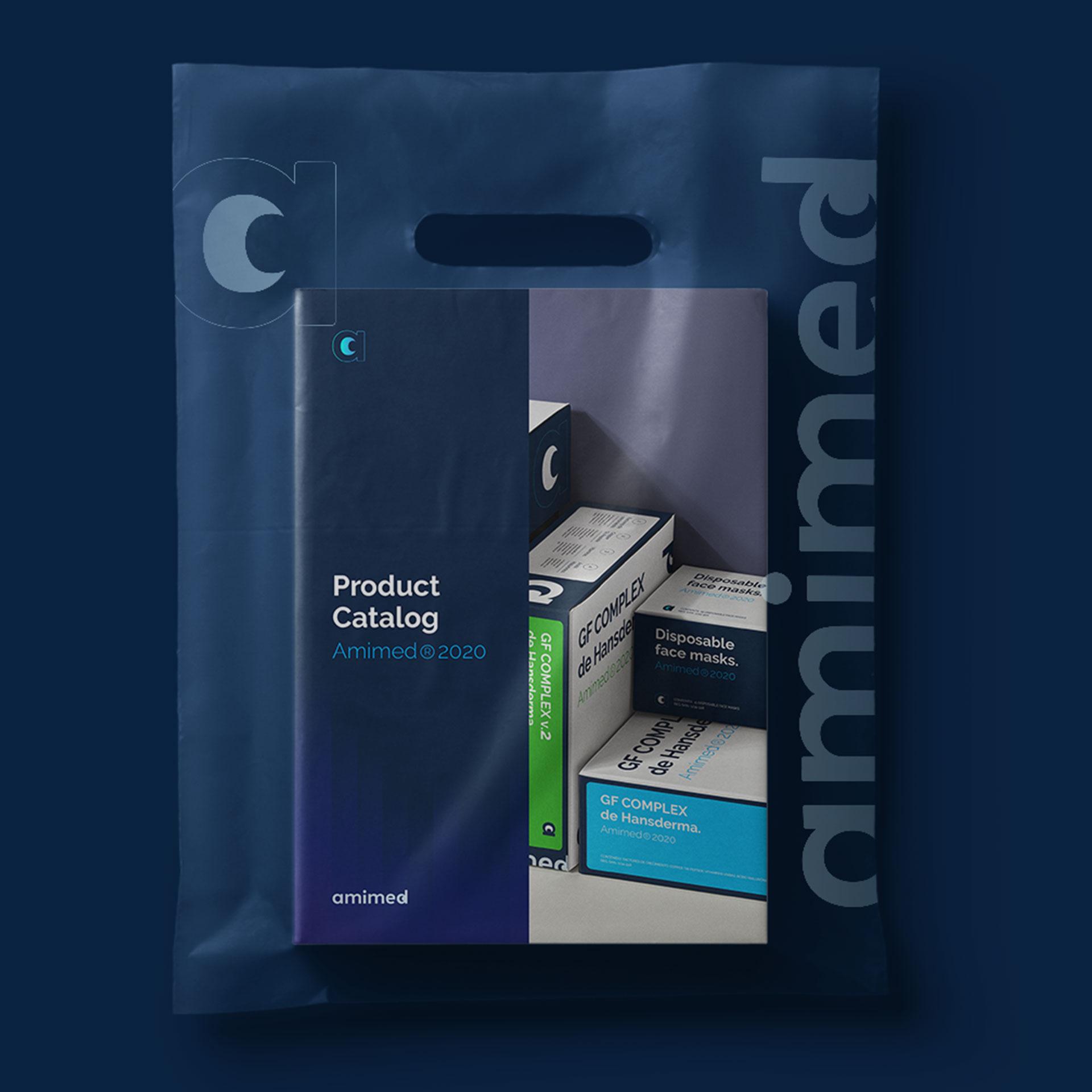
Amimed. A translucent navy shopping bag with the wordmark, holding a product catalog and boxes.
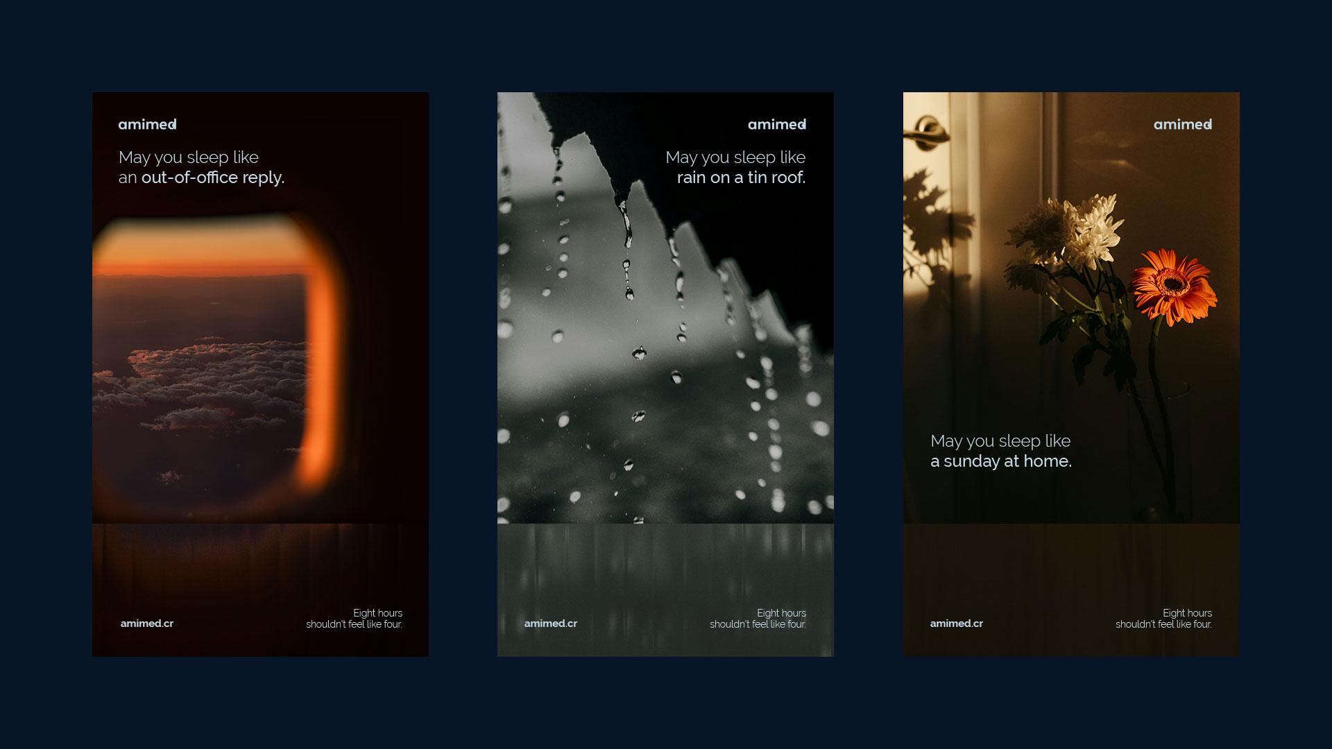
Amimed. Three social posts from the "May you sleep like" series, over photos of clouds, rain and flowers.
↑