Fitness
Base Programming
Always a work in progress.
The brief
A personal training brand for athletes who are never quite finished, and never want to be.
The idea
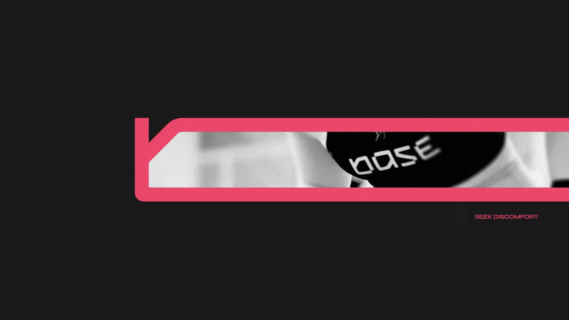
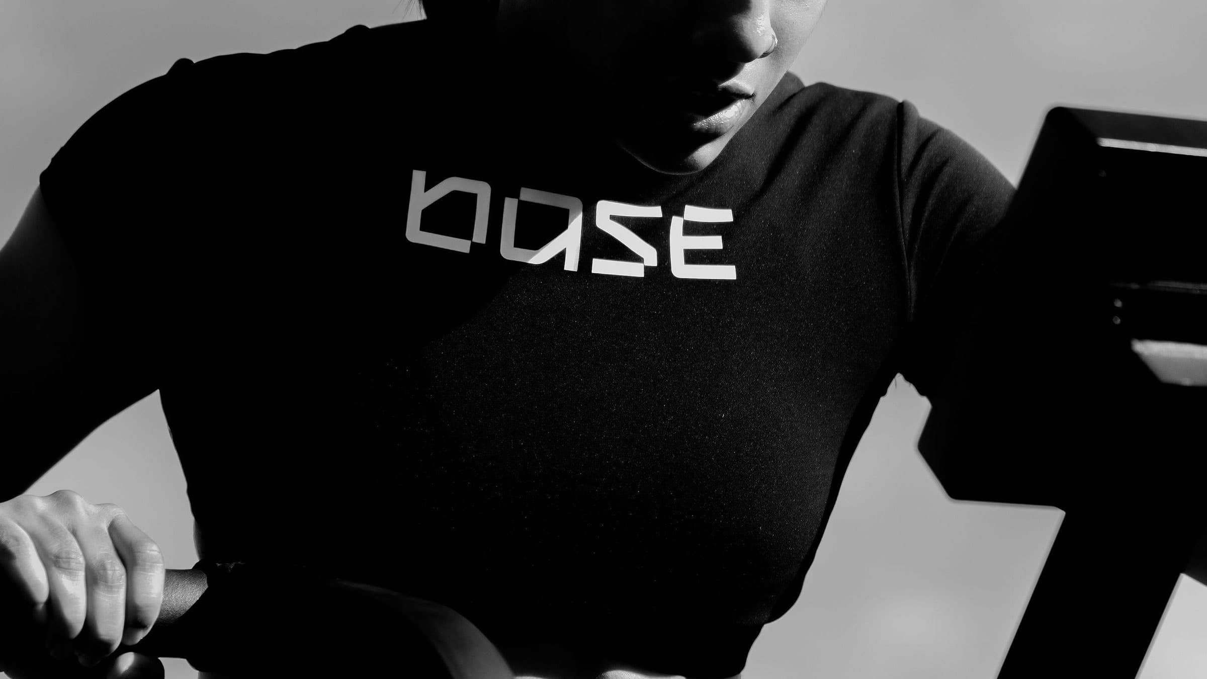
Base is built around one idea: "Seek discomfort." Progress happens right at the edge of what feels finished, so the identity was built to never quite feel that way either.
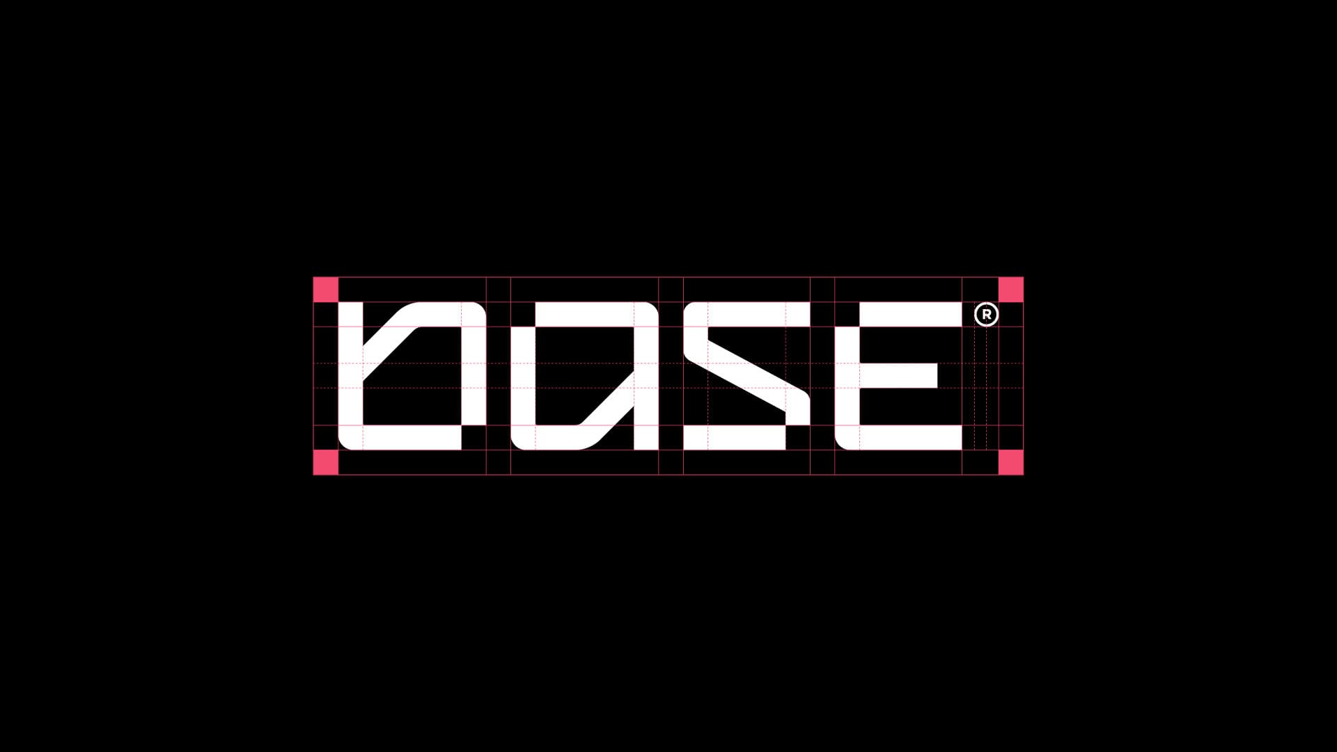
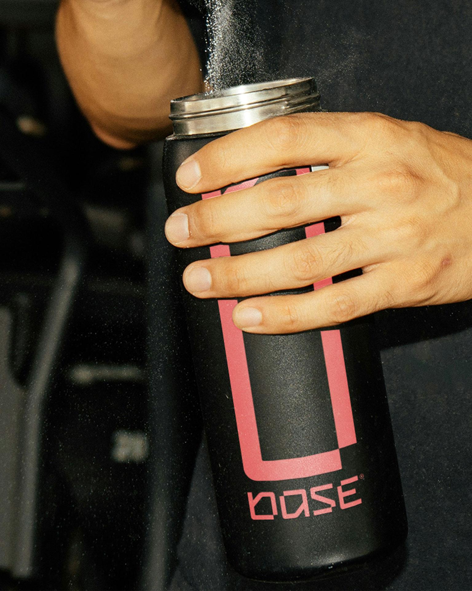
We built a geometric typeface from scratch just for the logo, each letter missing its last piece, on purpose. The wordmark stretches too: it adapts to fit whatever it's placed on, the same way the athletes training under it do to whatever the day asks of them.
- Base Programming
- 2024
- Fitness