Law
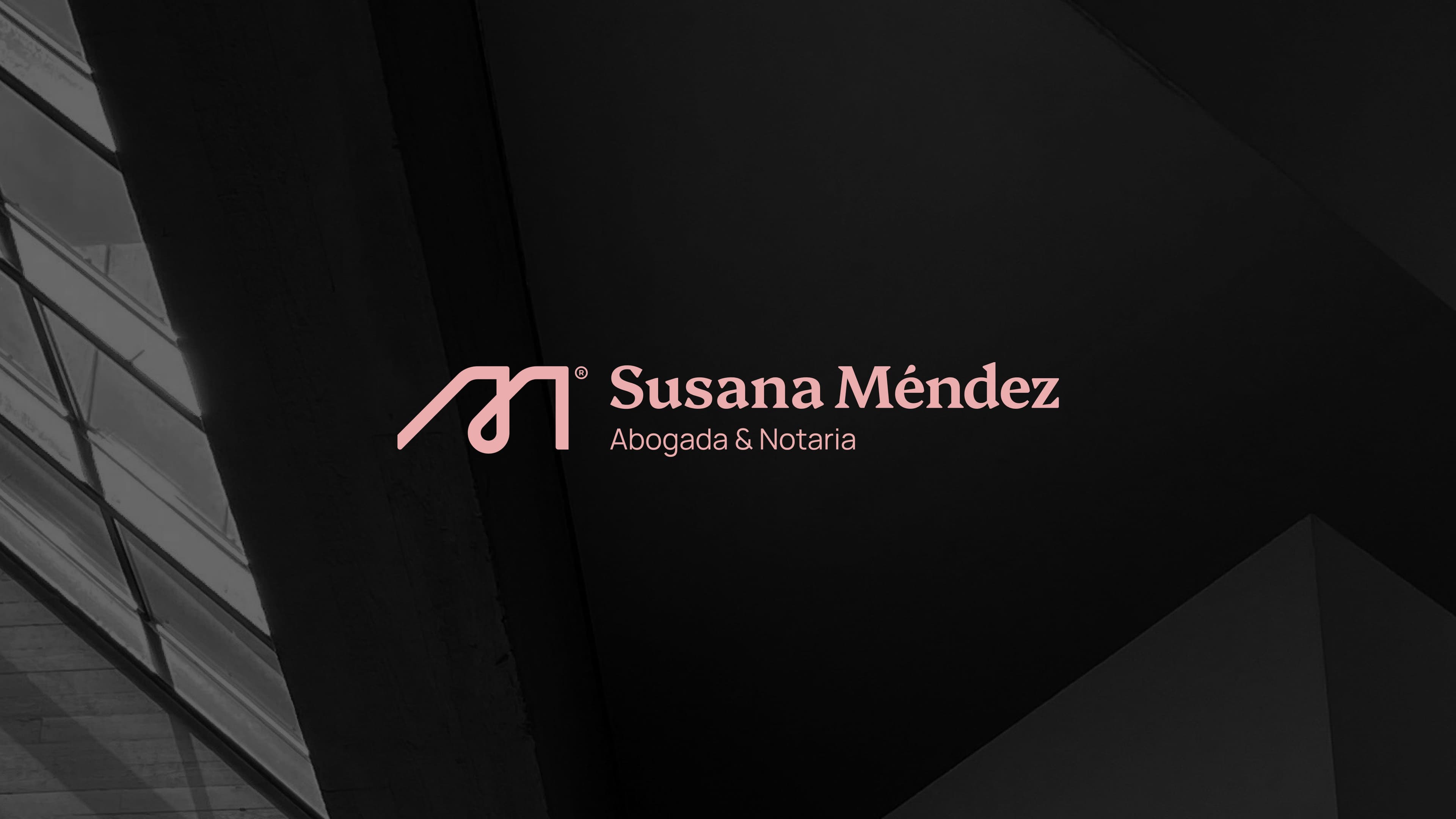
Susana Méndez
Signed, not stamped.
The brief
An independent lawyer and notary, built to stand out in an industry that's used to looking one way. And a brand that works the same way.
The idea
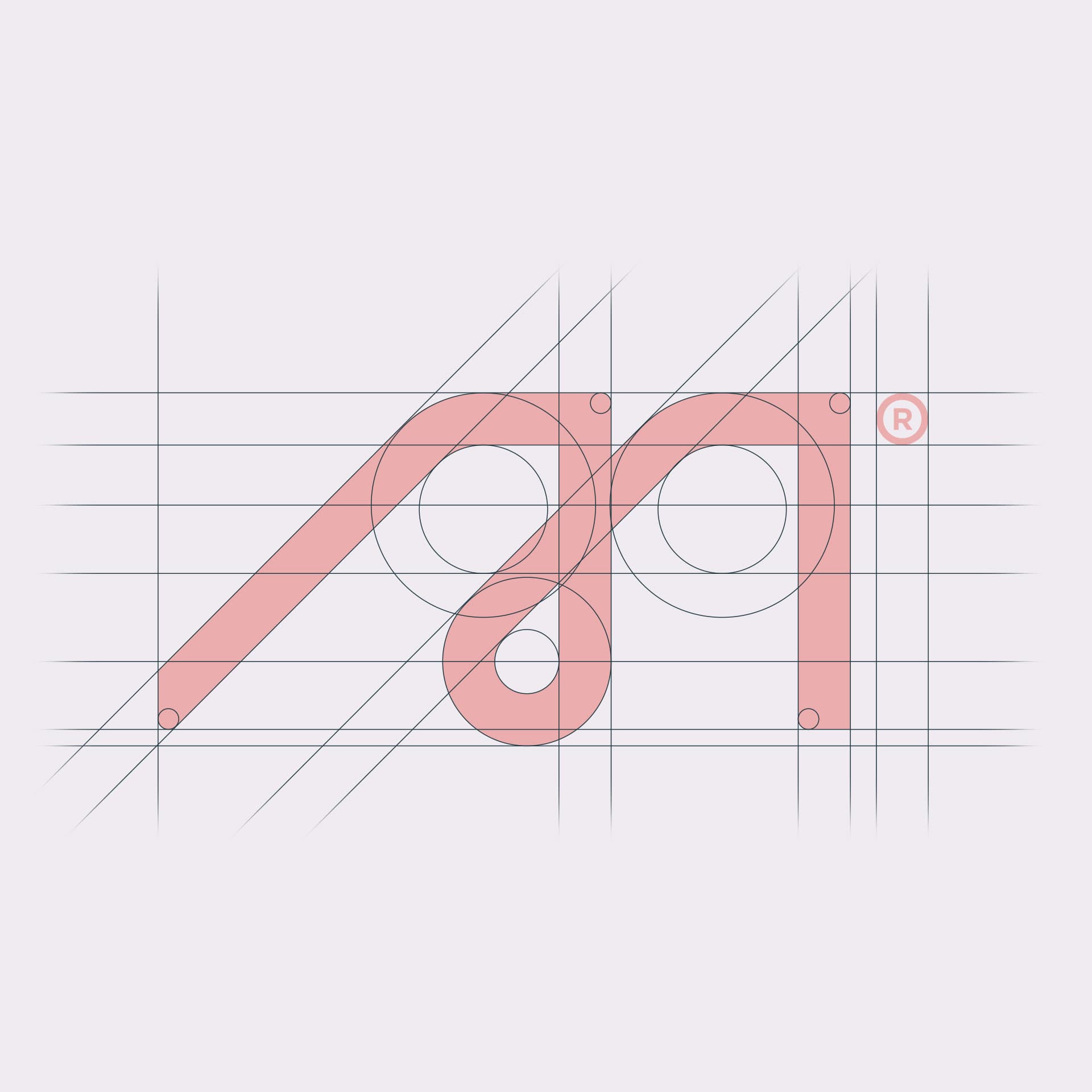
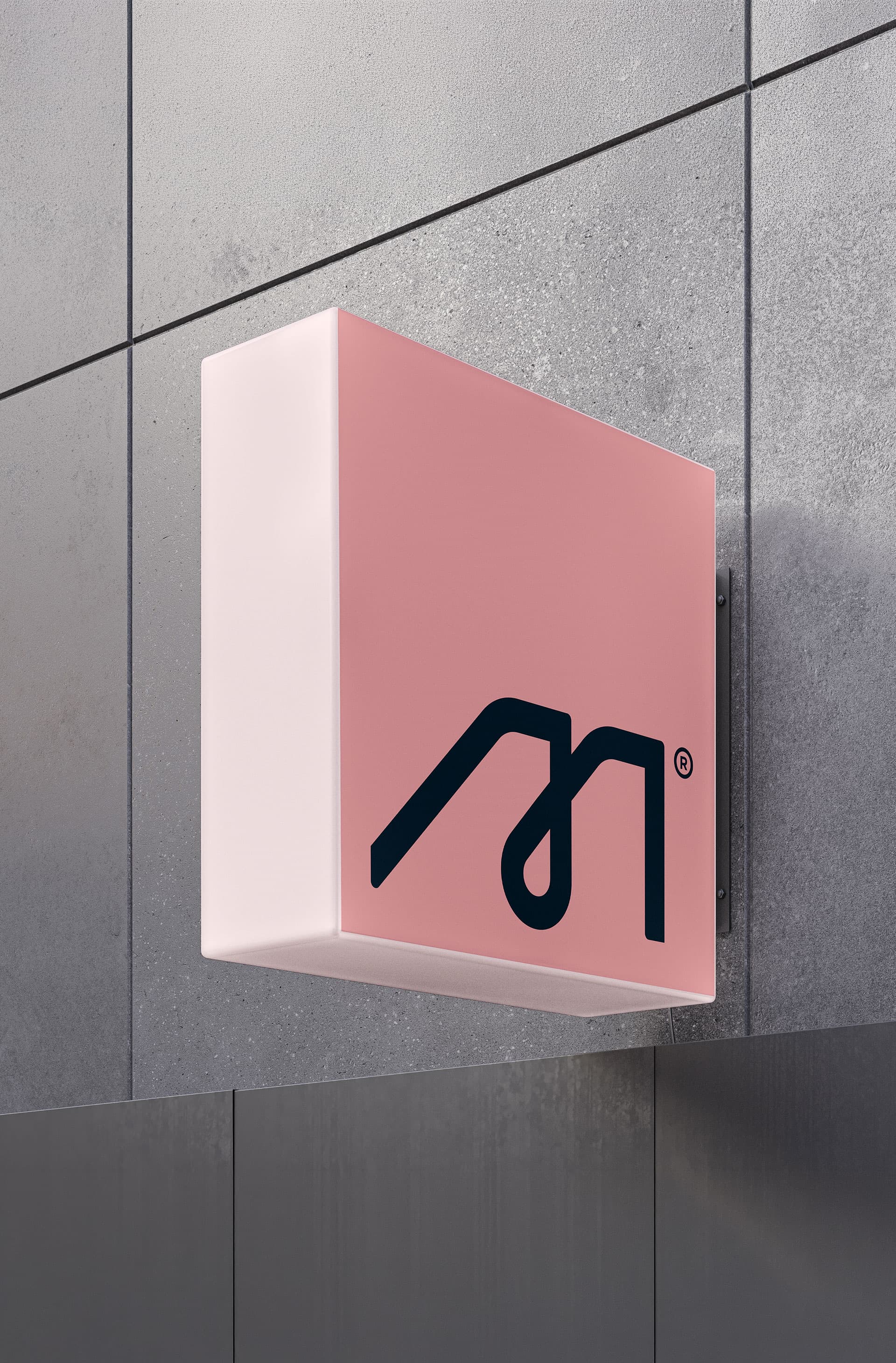
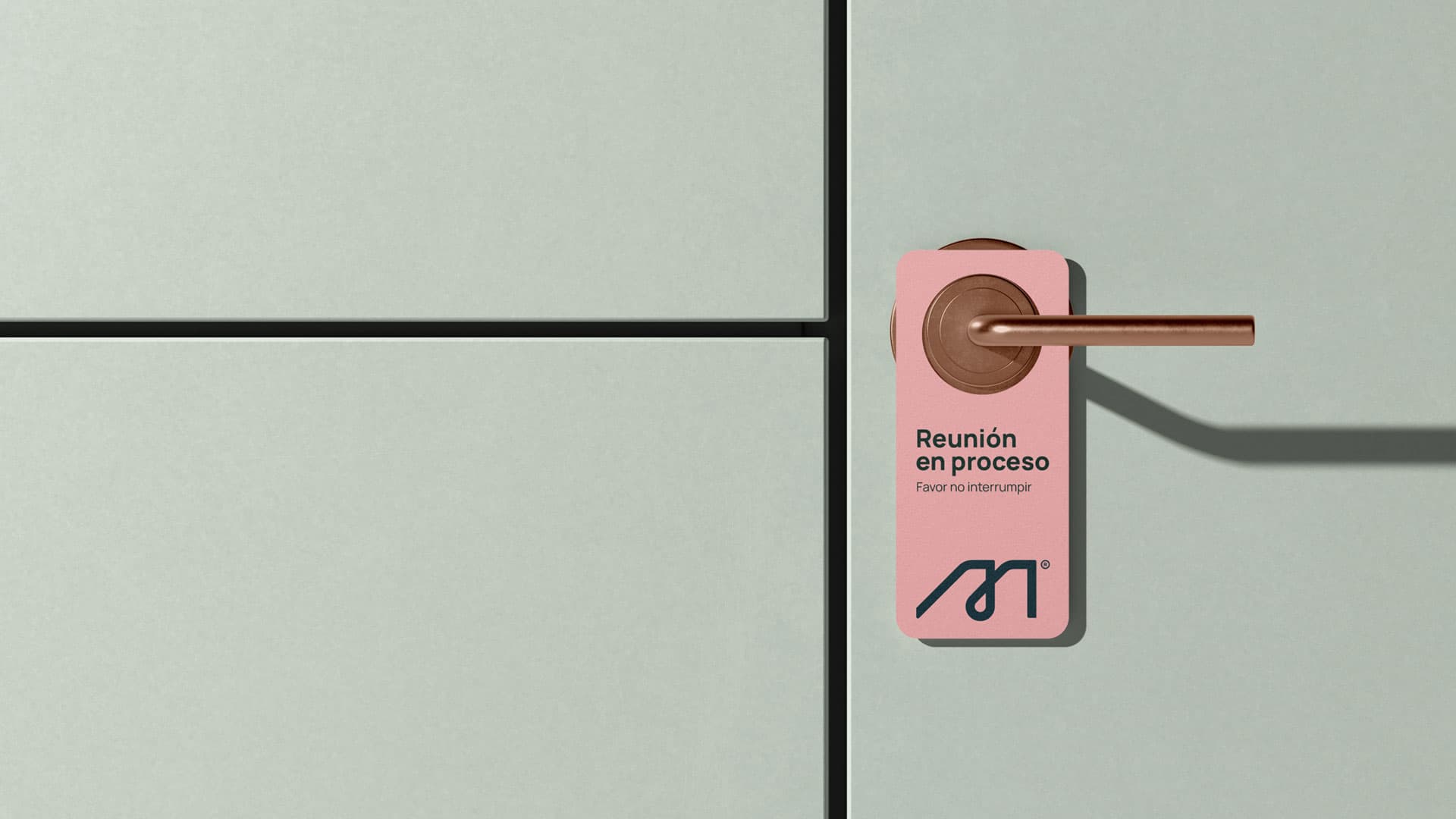
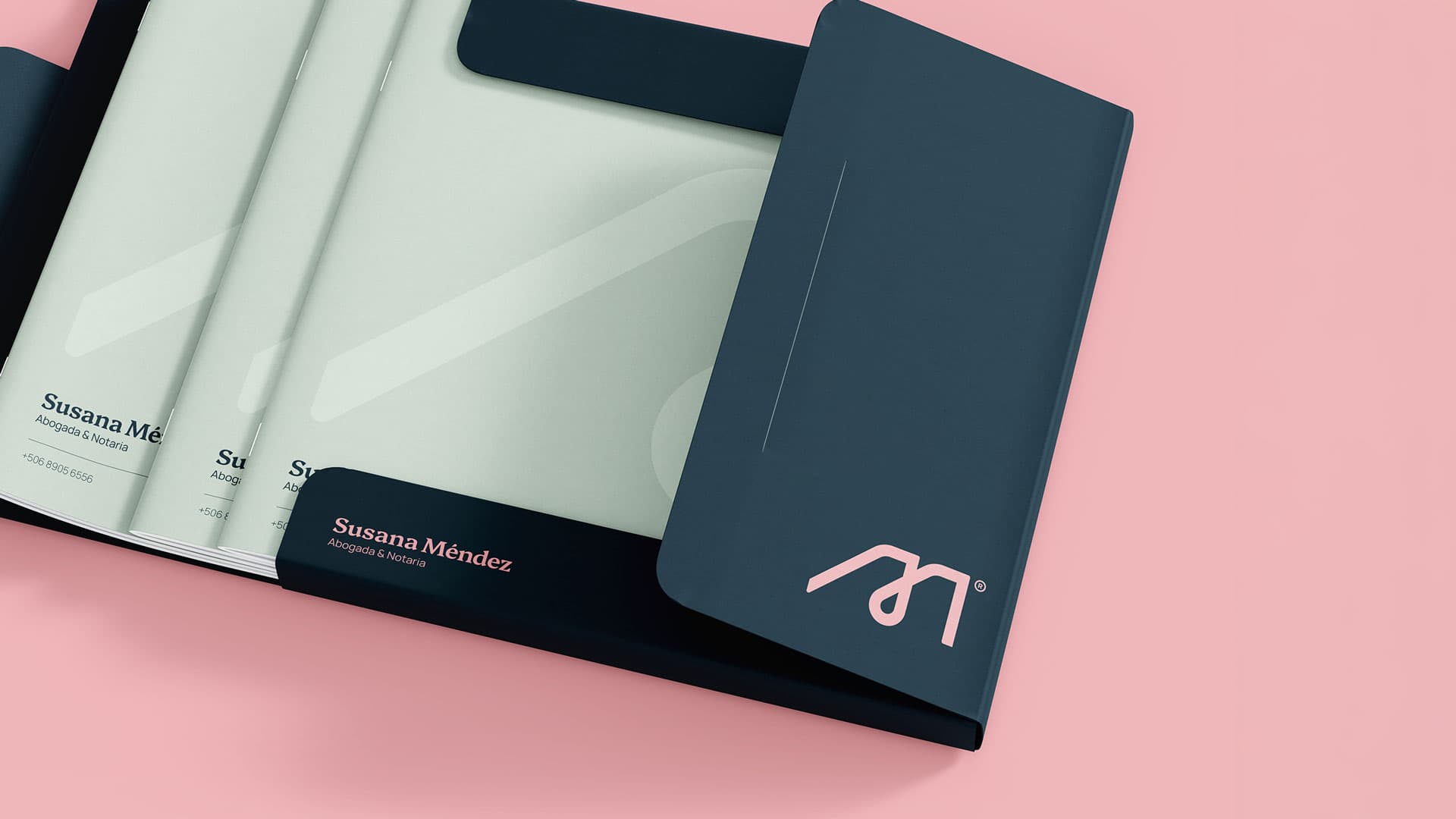
Susana Méndez needed a brand that read as credible as any law office, in an industry still mostly run by men. So the identity is built around an idea, not a look: her initials, and the scales of justice, folded into a single mark serving as her own signature.
The result reads as personal as it does professional, a brand that stands out for the same reason she does.
- Client
- Susana Méndez
- Year
- 2025
- Industry
- Law