Tresunotres
Puralma. Cover image
Food & Restaurants

Puralma

An identity as bold as its food.

The brief

A brand update for Barrio Escalante's staple vegan kitchen, made for a more mature chapter.

The idea

Puralma opened in Barrio Escalante and let the kitchen speak first. No fuss, just food good enough to make it a regular stop in one of Costa Rica's most visited neighborhoods, celebrities passing through the country included.

That kind of reach called for a brand that could hold it. We built the identity around "Revolutionary but kind," the same conviction that built the kitchen's reputation in the first place, now given a face that matches where Puralma stands today.

The result is a brand that reads as confidently as the food tastes: ready for a bigger stage, without losing the kindness that built it.

Client
Puralma
Year
2026
Industry
Food & Restaurants
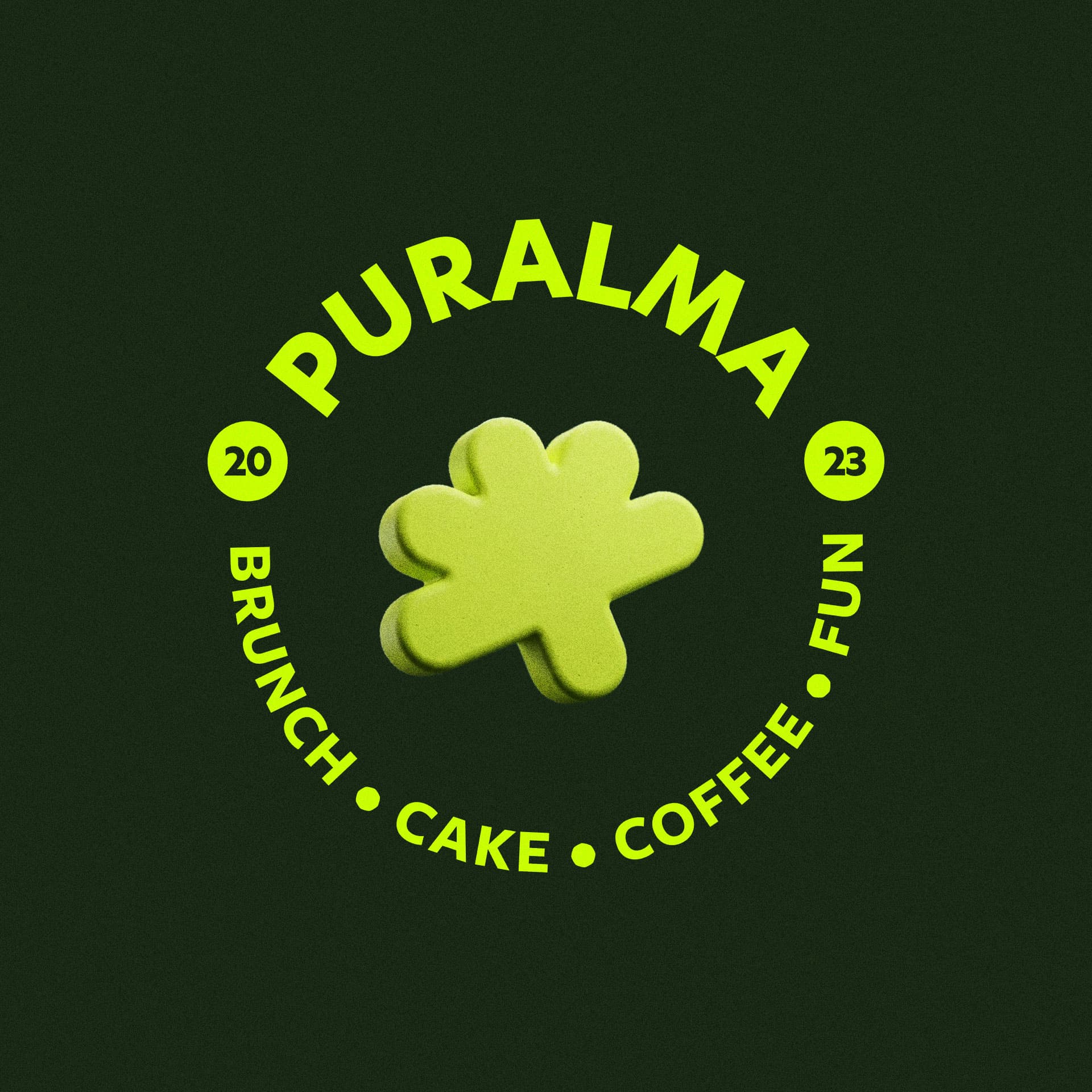
Puralma. A circular brand stamp with the flower mark, wordmark, and "Brunch, Cake, Coffee, Fun."
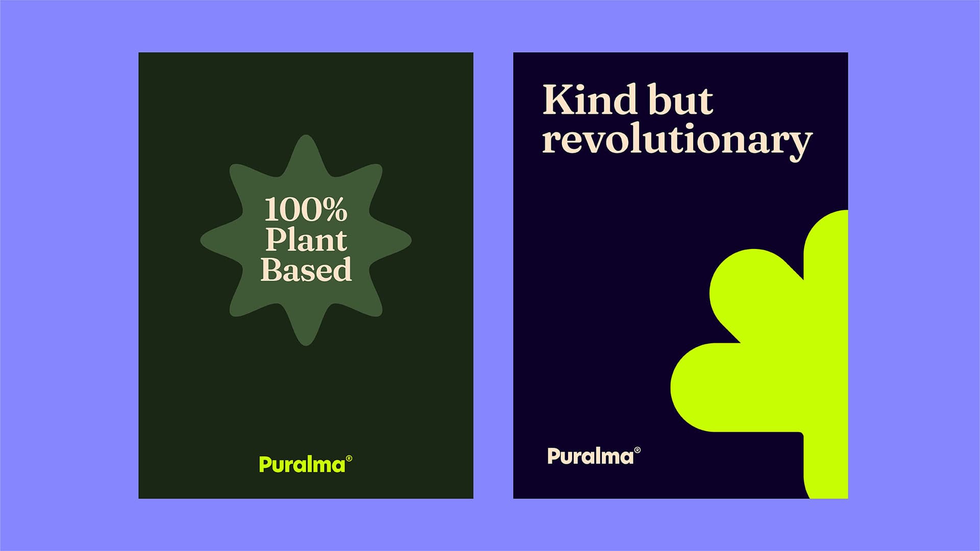
Puralma. Brand posters: "100% Plant Based" and "Kind but revolutionary."
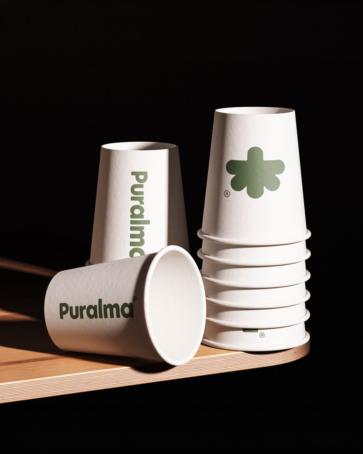
Puralma. Branded paper cups stacked on a counter.
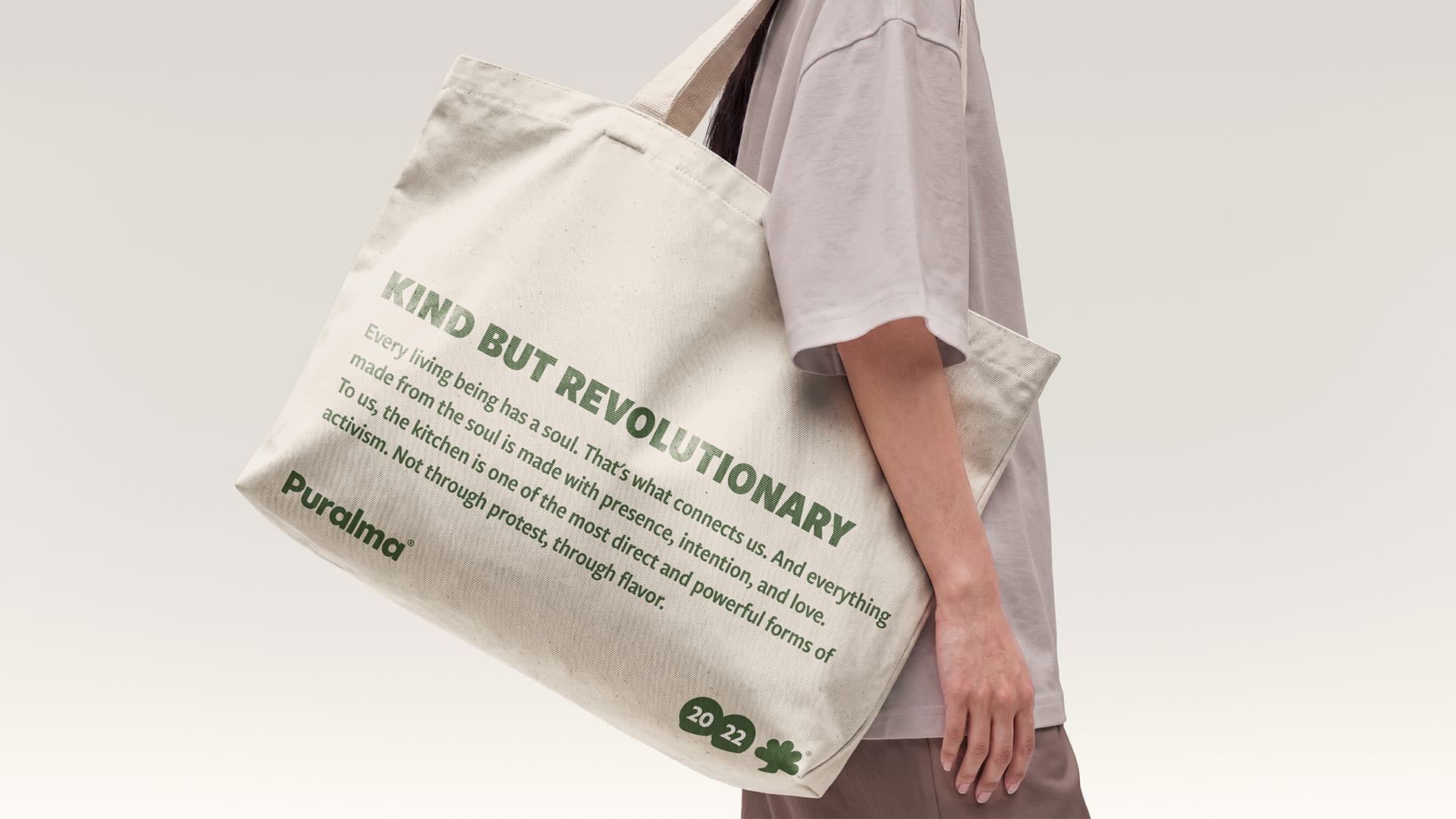
Puralma. A tote bag reading "Kind but revolutionary," carried over the shoulder.
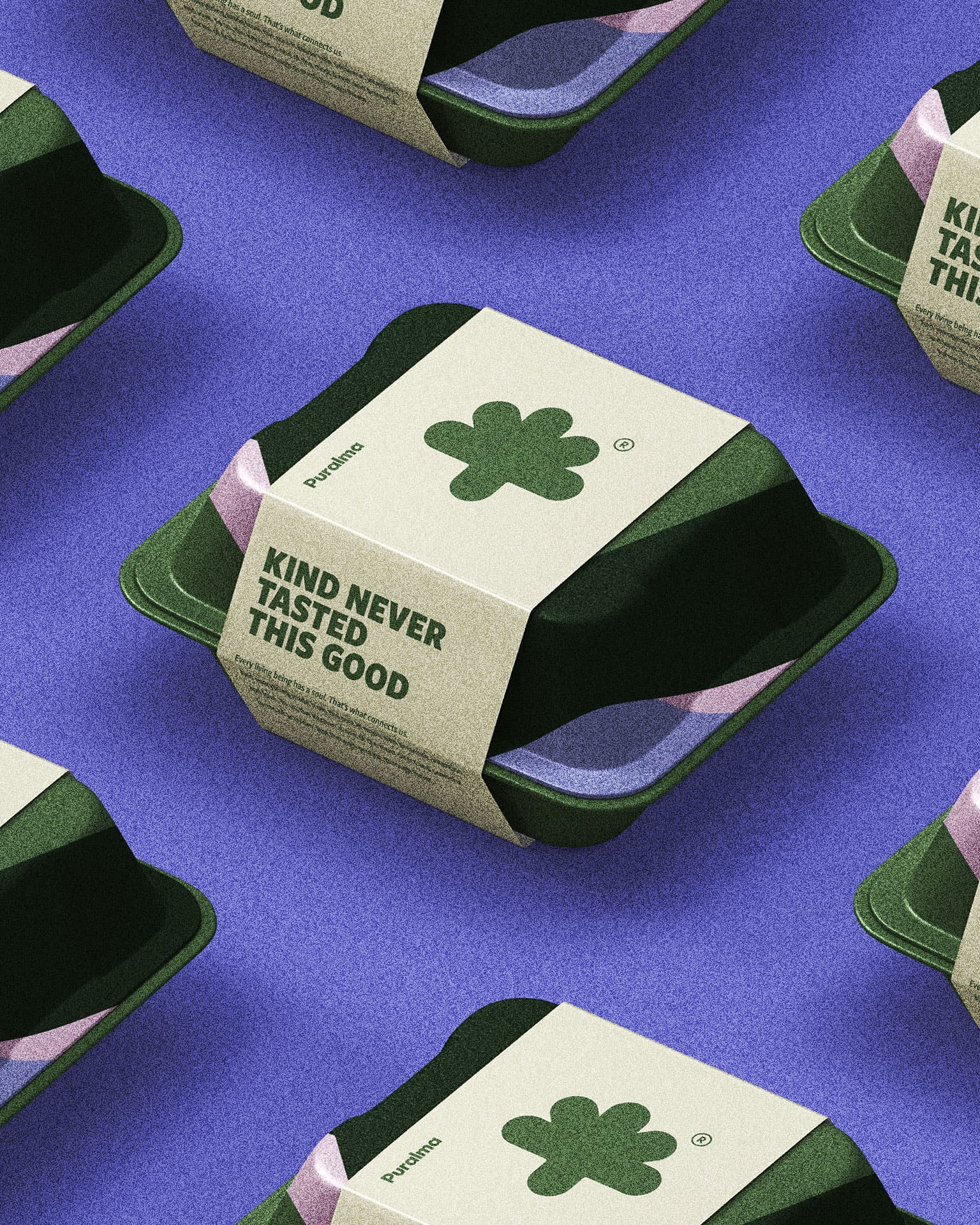
Puralma. Takeout containers banded with the flower mark, repeated in a grid.
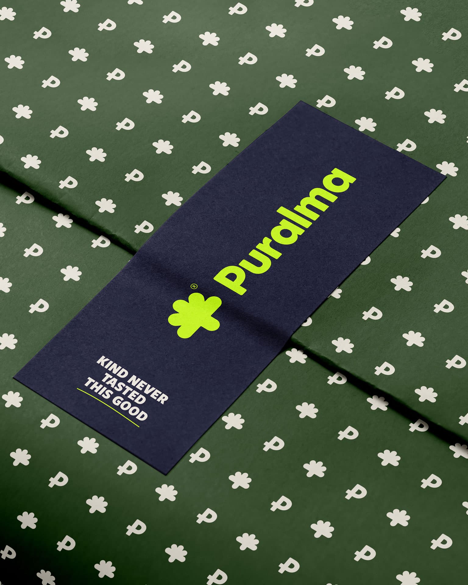
Puralma. Wrapping paper in the brand's flower and wordmark pattern.
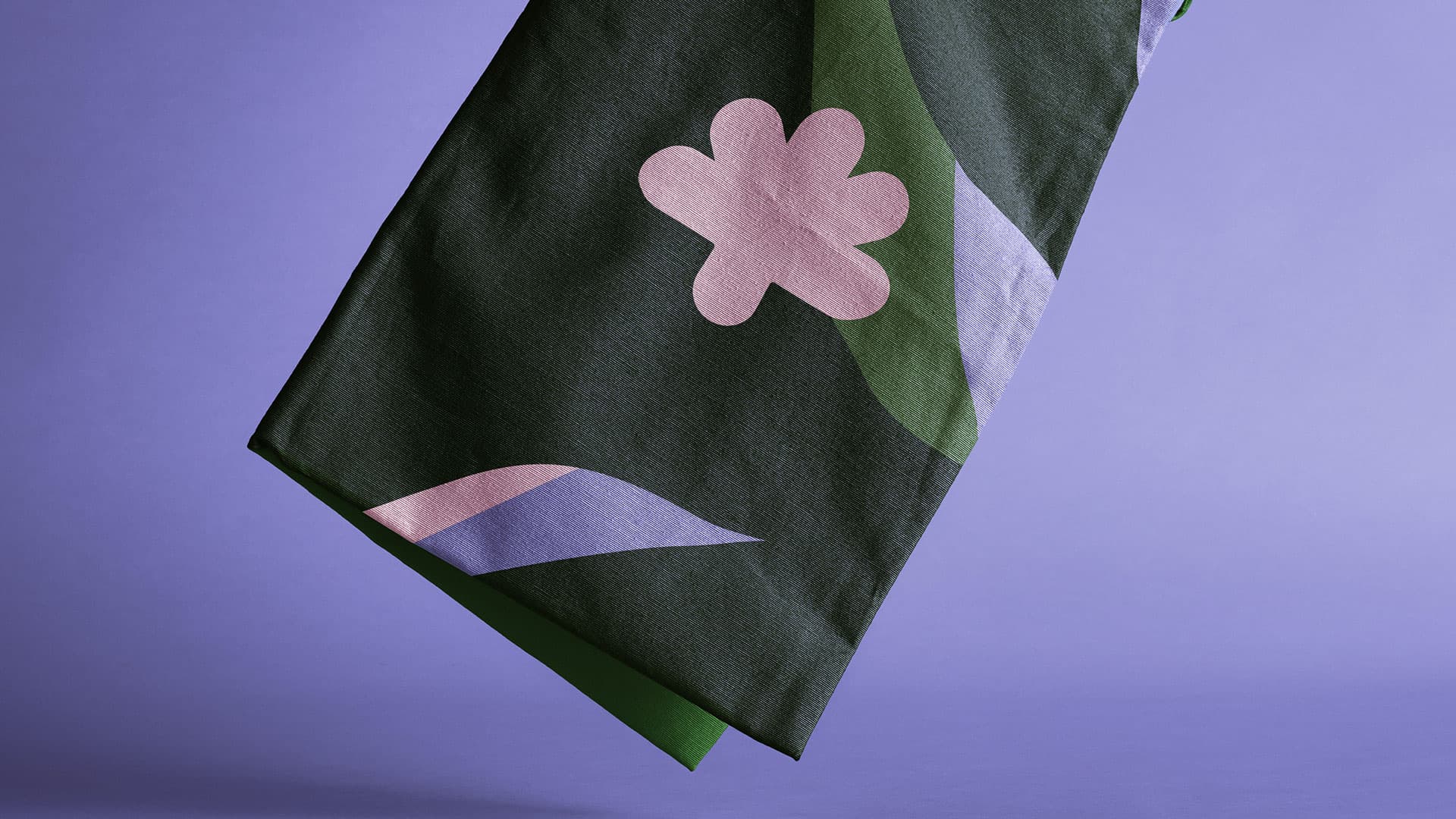
Puralma. A textile in the brand's pattern, caught mid-fall.
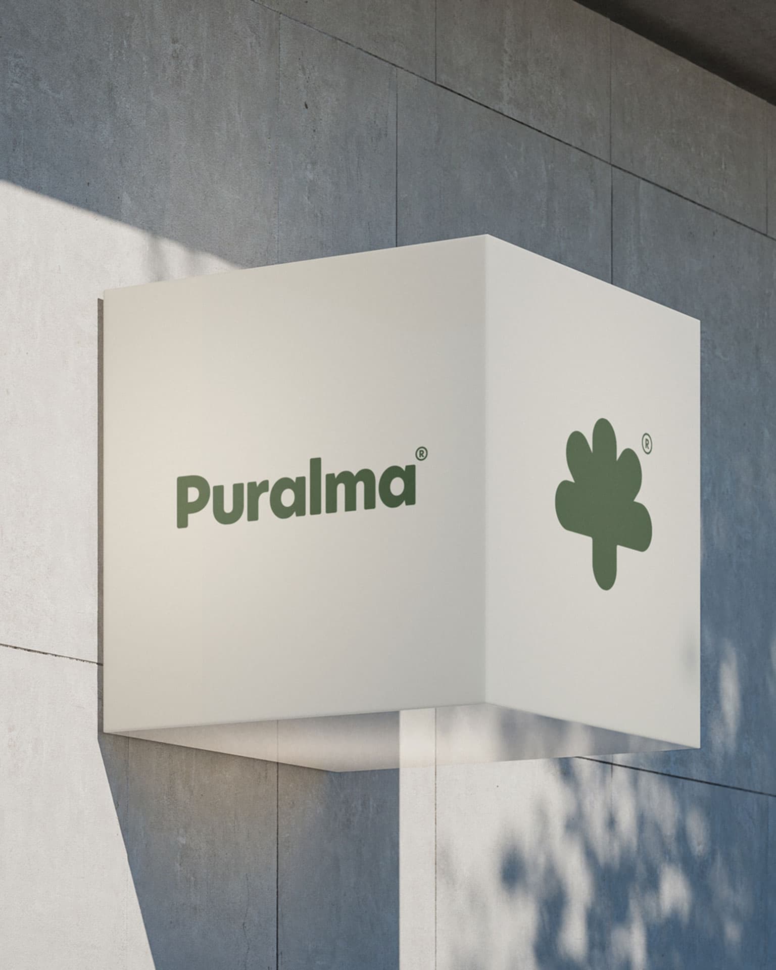
Puralma. Exterior signage with the wordmark and flower mark.
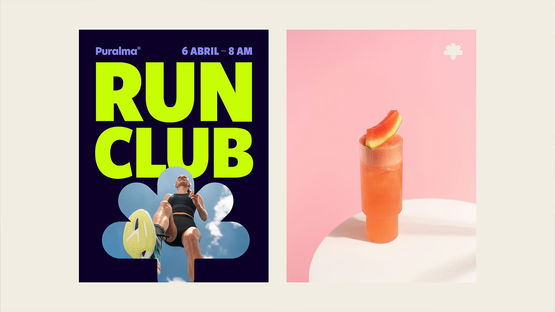
Puralma. A Run Club event poster beside a watermelon agua fresca.
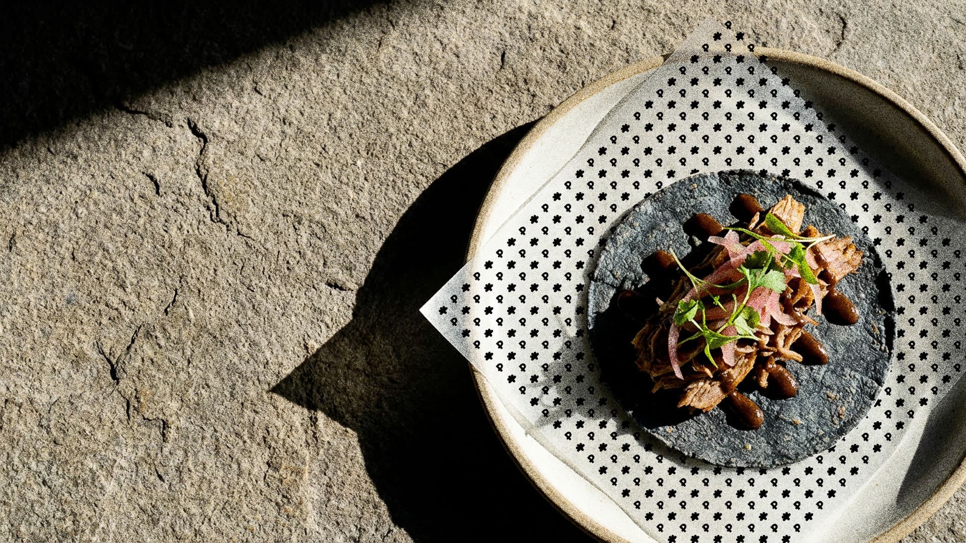
Puralma. A taco on a blue corn tortilla, on a patterned napkin.
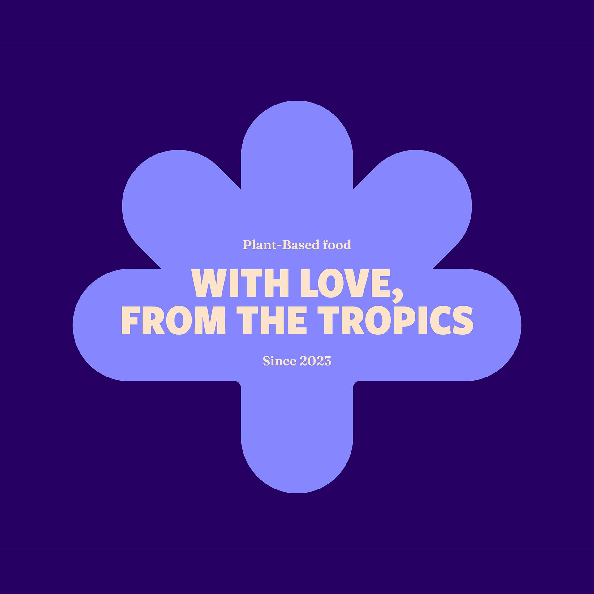
Puralma. The flower mark and tagline, "With love, from the tropics."
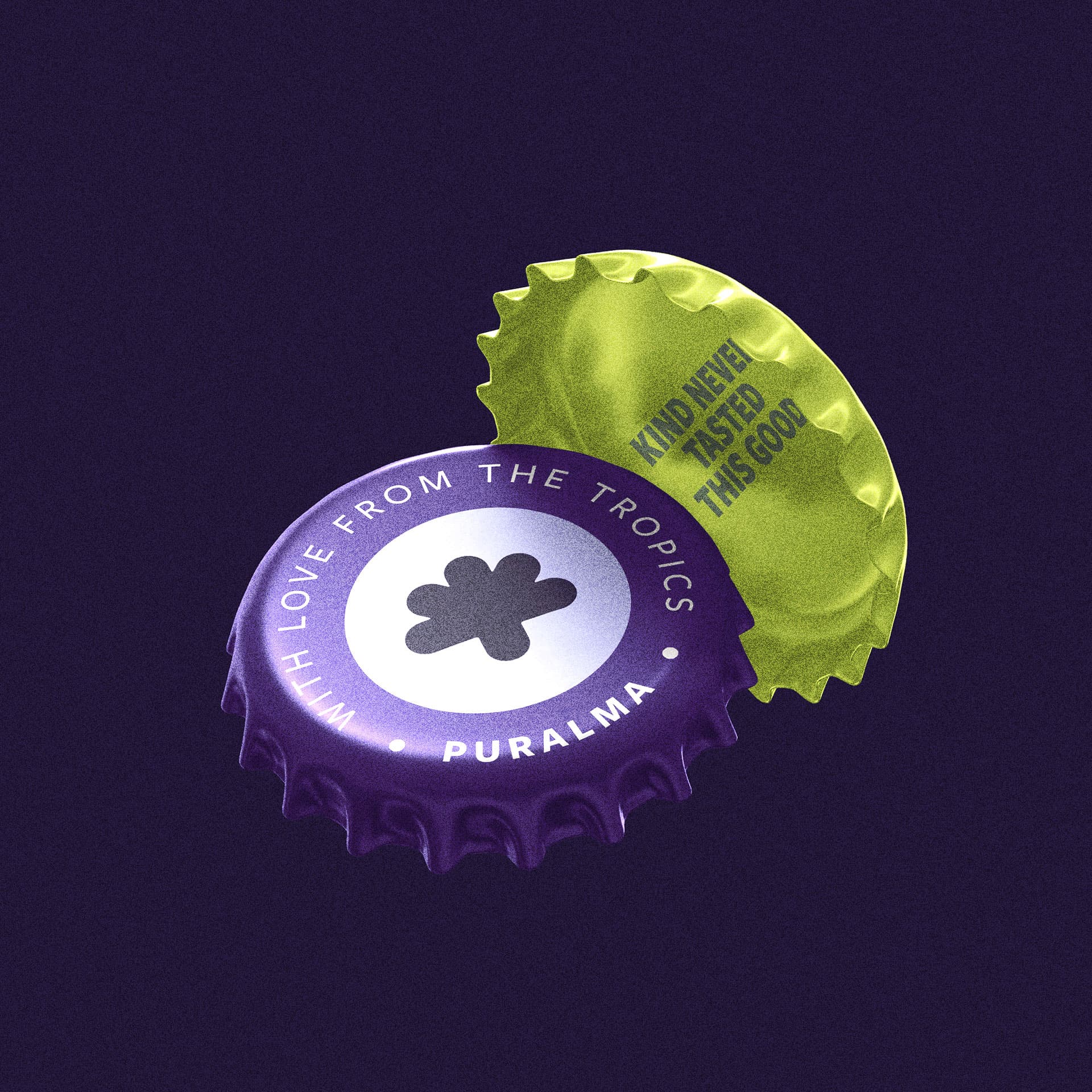
Puralma. A bottle cap opened to reveal "Kind never tasted this good."
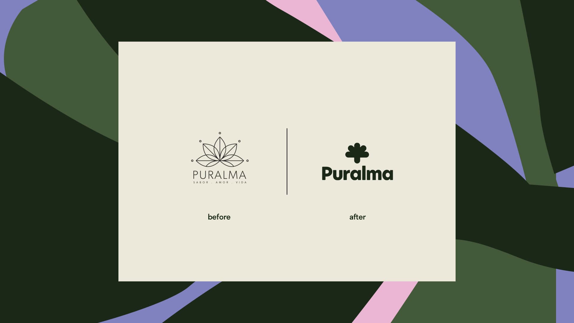
Puralma. A before and after comparison: the previous logo beside the new flower mark and wordmark.
↑